Why Futura is my favourite font.
- lrs1804
- Jan 10, 2023
- 3 min read
I have found font to be a trivial subject to those outside of the design industry, getting strange reactions to my enthusiasm about font and specific disliking to certain fonts I have pointed out to friends. Comparing that to my experience of other designers - almost every product, graphic, interactive, computer or whatever designer has a favourite font and a curious and sometimes irrational dislike to others.
Futura is my favourite. Recently on a holiday to Copenhagen I visited the Louisiana Modern Art Museum and was happy to see the font exhibited as part of 'The Cold Gaze - Germany in the 1920s'. This exhibition was all about the huge changes in style that occurred during the post war 1920s in the Weimar Republic which saw German people experience turbulence and crisis after in the wake of the Great War. From the Louisiana website:
"Urban life, modern, functionalist architecture, industrialization and technological advances are widespread motifs for the artists of the period, but also the vivacious entertainment life of the time with nightclubs, cabarets, sexual liberation, promiscuity and prostitution. At the same time, socially critical depictions of the harsh living conditions of the working class, the new role of women and the decadent lifestyle of the upper class are seen. These are all themes that the exhibition unfolds across the arts and with the help of extensive historical documentation material."
This period of German history saw great design coming from the Bauhaus and its famous individuals such as Marcel Breuer who designer the Wassily chair during this period and Margarete Schütte-Lihotzky who designed the Frankfurt Kitchen for the New Frankfurt Project of the time. Standardisation and functionality were key to the designs of the time and the Futura font is a key revelation of this period of German design and the Bauhaus movement.

In 1924 the graphic designer Paul Renner (1878-1956) worked on designing the Futura typeface which he proposed as the official typeface for all of the city's signage in Frankfurt where we worked as a teacher in the Frankfurt School of Applied Art. The design was then commercialised in 1927 by the Bauer foundry and immediately became a worldwide success.
The letters are based on simple geometric shapes such as circles, squares and triangles and stripped of all elements considered to be superfluous, such as serifs. With his elementary design Renner aimed to create a typography in harmony with the rational spirit of the time, with its eyes on a modern future.
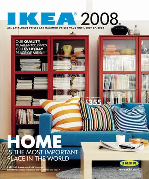
From its initial conception, Futura has been used all over the place and remains a vital typeface family. It is used in headers, body text, newspaper headlines, you name it. Notably the font has been used in advertising by brands such as IKEA, Supreme, Volkswagen and even NIKE who use future condensed extra bold for a lot of their advertising in the 90s and 2000s.
Maybe it's because all of these brands are ones I have used and bought from over the years but it just seems like the most universal and clean font families there are. It is immediately impactful and I get a lot of visual inspiration from advertising campaigns that have used it such as vintage Nike adverts from the 90s with big, bold text and clear images.
It has been used in Film and TV a lot as well, most notably in the kids show Sesame Street where the font was used whenever letters, words or numbered appeared on screen. The simple shapes easily digestible by the children watching. Some filmmakers use it in almost every film they make, Wes Anderson uses it often and it was well known to be Stanley Kubrick's favourite typeface.
The typeface is synonymous with design movements all the way through the 20th and 21st century with its different variations being repeated over and over all across different mediums, products and companies.
Will Futura ever get old?
Sources:


Comments